10 Auto Margins 自动外边距
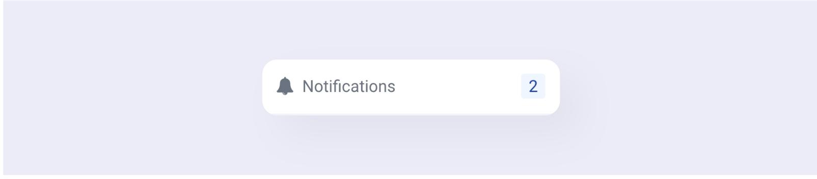
通知菜单项 示例 10a
示例由 Naresh 提供。
这是一个非常小的组件示例,图标和文本在左侧,右侧是一个计数。
HTML 标记
html
<div class="container">
  <i>...</i>
  <span class="text">Notifications</span>
  <span class="count">2</span>
</div>
如果你能将图标和文本包裹在另一个 div 中,我们可以使用justify-between来实现这种外观。但是,在不编辑此 HTML 的情况下,你能获得相同的外观吗?
实现这一点的一种方法是向.text元素添加flex-grow。这里还有另一种解决方案。
解决方案
html
<div class="container flex align-center">
  <i>...</i>
  <span>Notifications</span>
  <span class="count ml-auto">2</span>
</div>我们向计数元素添加了ml-auto,即margin-left: auto,只是为了将其推到右侧。
外边距实用类可以与弹性项目一起使用,扩展外边距以占据额外空间。因此,在上面的示例中,左边距占据了左侧的所有额外空间,将元素推到了右侧。
如果你还记得,在示例 4e - 解决方案 2 中,我们使用m-auto将单个弹性项目在其容器中居中。原理是一样的。
多列页脚 示例 10b
这是另一种常见的页脚结构,左侧是徽标 Logo,右侧“推”着几列内容。

根据你在上一个示例中看到的内容,你能使用自动外边距得到这个结果吗?
HTML 标记
html
<footer>
  <div class="footer-col">...</div>
  <div class="footer-col">...</div>
  <div class="footer-col">...</div>
  <div class="footer-col">...</div>
</footer>
解决方案
我们需要将第二列“推”到右侧。
html
<footer class="flex">
  <div class="footer-col">...</div>
  <div class="footer-col ml-auto">...</div>
  <div class="footer-col">...</div>
  <div class="footer-col">...</div>
</footer>